
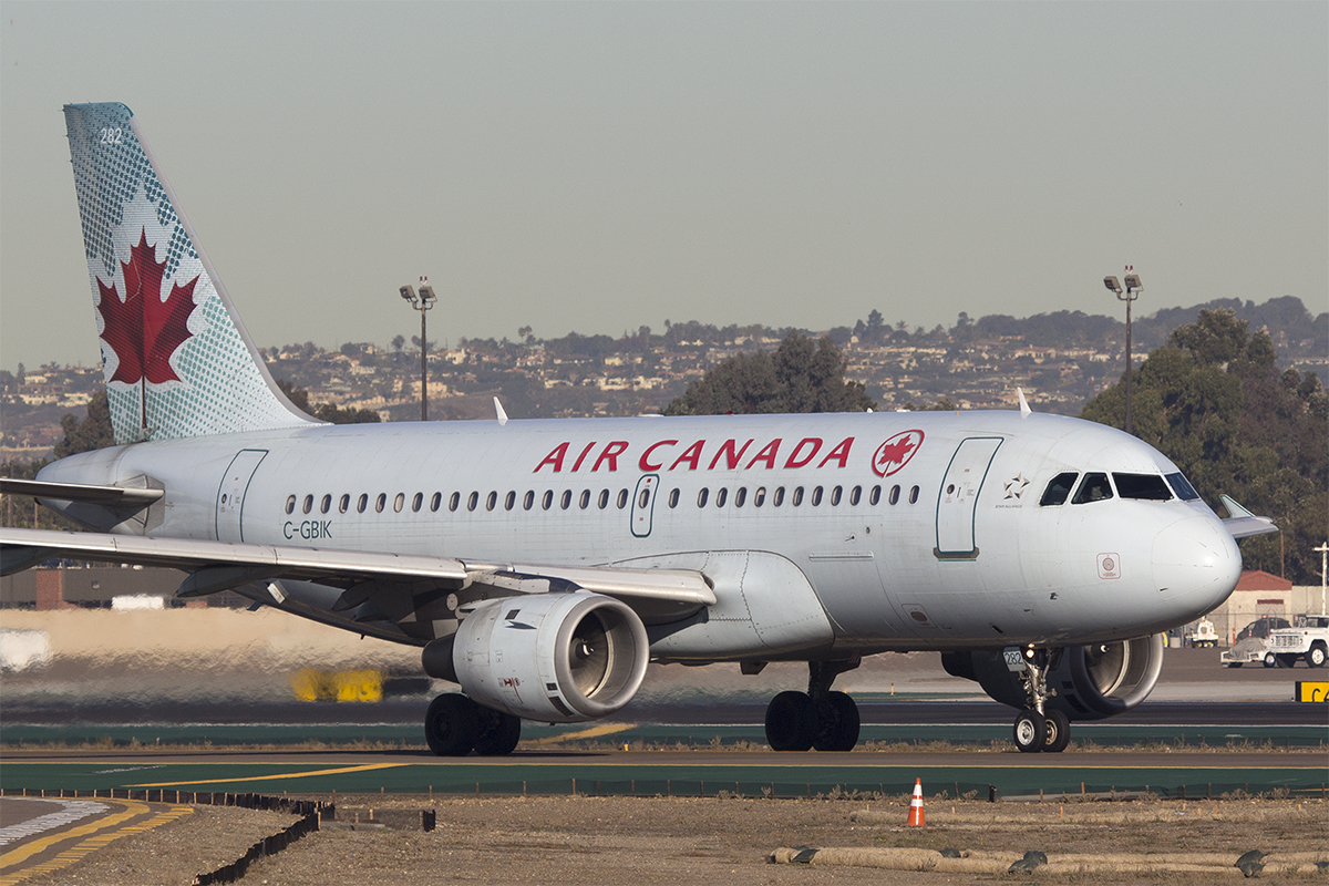
There’s been rumors floating around for a long time now that Air Canada would be unveiling a new corporate identity and livery sometime soon, and I was as shocked as anyone to hear about it. In my not-so-humble opinion, AC has one of the best liveries out there at the moment; bright and colorful, clean, and a refreshing change of pace from all the other “euro white” liveries that so many other airlines tend to gravitate towards these days. Never mind that it’s often referred to as the “toothpaste livery” – I really like it and it’s one of my favorites for sure.
But they did it. Last Thursday (February 9th), in a cold and dark hangar at YYZ, Air Canada proudly unveiled their new corporate identity to the world. And people lost their minds.
I’ve been following the airline business for a long time now, and seeing negative reaction to an airline livery modification/change is nothing new. The Delta Air Lines “wavy gravy” / “deltaflot” scheme of the early 2000’s, Iberia’s new colors, American Airlines change from polished aluminum to silver paint – I remember these unveilings vividly, along with all the crying and sobbing across the internet from airliners.net to flyertalk to twitter about how the designers of those liveries were talentless hacks. People (especially nostalgic AvGeeks) hate change. It’s completely understandable though, as it’s natural to build a mental attachment to what’s comfortable and familiar. Seeing a classic airline livery being replaced with something much more simple really hurts.
Airline livery design is more complicated than most people think
One of the biggest complaints I hear from airline enthusiasts about the new Air Canada livery is that its so simple that they “could design something better in MS Paint”. And once they learn that AC paid international design firm Winkreative a lot of money for this brand refresh, heads start exploding. On the surface, I agree – it does seem a bit mind blowing that Air Canada (and any other airline going through a brand refresh) is willing to pay upwards of millions of dollars for a simple white livery design with a few splashes of color here and there.
But I’m here to tell you that the design process at the corporate level is anything but smooth and there’s a lot more that goes into these kinds of things than most think. I should know, as I am a senior visual designer for a large fortune 100 company here in the US and I deal with this kind of stuff on a daily basis. No, SANspotter.com is not my day job quite yet, but I am working towards that goal.
Based on all my years of corporate design experience, and enduring all the struggles that go along with it, I’m willing to bet that the design process for the new Air Canada livery went something like this:
- Air Canada execs feel like a brand refresh is in order. They hire a brand marketing team (Winkreative) to help.
- At first, there is a buzz of excitement and giddy anticipation on both sides; Air Canada is looking forward to evolving the brand into the future, and Winkreative is hyped to be a part of a brand refresh as big as this.
- Air Canada gives Winkreative a few loose constraints for the new design (must have specific colors, must contain certain elements, etc), but in general they let Winkreative run free with the ideas to generate a series of amazing concepts.
- Winkreative comes back to AC for the first design review, and the execs are blown away. I’m confident that some of the first designs were fairly intricate, and I’m equally sure that AC was excited as ever after seeing the first round of design work. Corporate execs love this kind of stuff – it’s a lot more exciting than complicated spreadsheets and dry PowerPoint templates!
- Air Canada, as happy as ever but feeling pressure to keep costs down, gives them feedback after the first round which amounts to asking for a change in design direction. Most of of these “suggestions” makes the Winkreative design team squirm. They mutter frustrations amongst themselves as they walk out the door, but they are still determined to create a world class design.
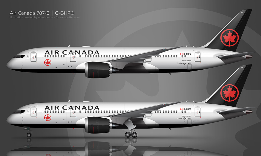
- This goes on for several more rounds, and all of the constraints from Air Canada (paint costs, maintenance, labor, etc) have taken their toll and what was at first a beautiful flowing livery concept has finally emerged as the eurowhite design that was unveiled in Toronto last Thursday. Simplicity always wins.
The fact that Air Canada set out looking for a beautiful livery update is a no brainer – it’s not like they intended to switch to something dull and plain. And I’m certain that Winkreative wanted to give them something the world has never seen. But reality (the cost of doing business) has an unfortunate effect on the design process. It’s extremely difficult to push out cutting edge design in cash-strapped industries such as this. The airline business is tough, and costs need to be cut wherever possible in order to stay competitive.
I’m as bummed as anyone that the toothpaste livery will be replaced with this seemingly plain color scheme. Yes, it looks overly simple when compared to what they have now, and yes Air Canada assuredly paid a lot of money for it. But what they ended up paying for were the man-hours it took to whittle down a really good first-round design concept into something that made the bean-counters happy. It costs a lot of money to maintain the appearance of a huge fleet of aircraft, and the sad truth is that a simple white livery is better for the health of a cash-strapped airline. It’s an unfortunate reality of this business.
For the record, I quite like this redesign and I’m looking forward to it taking to the skies soon.

")
")
AlexRG
I quite like the new livery. I had absolutely nothing against the old ‘toothpaste’ scheme, but I really like the sort of proto-retro vibe of the new one. The maple leaf roundel reminds me of the ‘good old days’ when logos were simple yet elegant (ahem, American), and the straight-across affect is a welcome departure from the endless parade of swooshes and curves we see these days (while there are tons and tons of good swoosh liveries, like Thai, Aeromexico, and Alaska, something different is always welcome). I do agree with you about the cheatline fetish (LOL) among some avgeeks. While I love myself a good cheatline, I’m fine with change. It’s super interesting to hear what a graphic design professional thinks about airline livery design… great article as always!
SANspotter
Thanks Alex! I like the new one too – kind of like a modern take on an old style, which I think is important for the evolution of the brand. Anyway, I felt like I had to write this after reading the thread over on airliners.net where everyone jumped on the “hate” pile for this redesign. There is a LOT that goes on behind the scenes of a design project of this scale, and seeing others blatantly throwing out comments like “I could do better in MS Paint” really bothers me for some reason. Lol!
Randy Preising
I never really liked the toothpaste livery, or the one previous to that with the more realistic leaf on the tail with the windsor blue. That said, I’m loving this new livery, and part of it may be nostalgia. I remember flying on AC as a kid, especially the “stretch” DC-8s. Using black is a bold move, and it also reminds me of the old DC-8s that had the black cowl on the nose.
Rouge’s use of the roundel was a nice try, but it’s a horrid airline. That’s my story and I’m sticking to it.
As a designer, I know things are way more complicated than most people realize. When people say things like “I could do better in MS Paint”, then they should try sitting in meetings and working with multiple stakeholders. Challenging, to say the least.
SANspotter
Oh yeah, as a 20-year corporate design veteran, the “I could do better in MS Paint” thing really bugs me as well. It happens with nearly every new airline livery unveiling, and none of them know the struggle of the design process (branding guidelines, timelines, budgets, logistics, etc). It’s not as easy as sitting down with Photoshop for an afternoon and spitting out a few concepts!
Albert
To be honest, the black mask in front of the flight deck actually looks cool.
SANspotter
I agree – it’s a neat element that really adds to the livery IMHO.
Peter
This looks more like an article for Norebbo than for SANspotter, but it was still pretty neat and informative.
Personally, I like both, and they’re among my Top 3 AC liveries, with a slight edge to the Toothpaste scheme. The current one is great (crisp colors, and very cool eyemask) but it looks too similar to Delta’s. The Toothpaste livery was more distinctive.
In case you’re wondering, my favorite AC livery of all time was the experimental Bare Metal one, which they tried out on a 767-200. Such a beautiful scheme
Scott (SANspotter)
Haha, yes, I wrote this long before I had the idea to start creating this kind of content for my Norebbo brand. For what it’s worth, I am planning on doing a full “history of the Air Canada livery” post (with lots of illustrations) for Norebbo.com eventually. I’ve already got a lot of illustrations for it, but it’s just a matter of writing it and putting it all together.
I don’t think that I’ve ever seen the bare metal AC livery! Sounds interesting. I need to check that out…